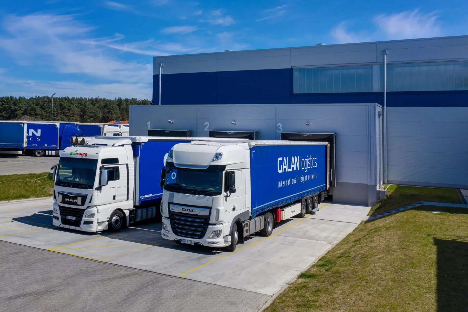
In 2016 Galan Logistics refreshed its brand, introducing a new logo and a new visual identity. It was a change for the better, brought about by how fast the company was growing, and part of building a strong brand that guarantees cargo gets through safely. That growth shows in constant investment in our own fleet and in the development of modern IT systems. Investing in our people and training them continuously, so that every customer gets the highest quality of service, is only one of the signs of how intensively the company is growing. The refreshed visual identity is meant to underline those changes.
Above all, the new image reflects the safety of the services Galan Logistics provides and the company’s rapid growth. The Galan Logistics brand is well recognised and associated with safety, hence the nod to the previous logo. The new version of the visual identity brings in the motifs of a dragon head from a viking ship, a shield, a crown and a road.
The shield

The shield reinforces the sense of safety and gives the logo as a whole a feeling of standing and prestige.
The viking ship
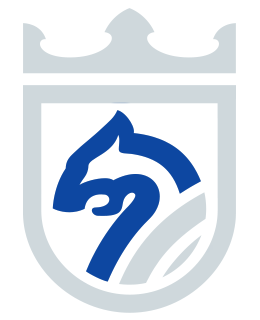
The viking ship stands for speed, decisiveness and courage. One hallmark of the longships were the carvings of dragon heads, which kept the vessels safe and their voyages successful.
The road motif

The road motif refers directly to transport, the most important service Galan Logistics provides.
The crown

The crown above the shield stands for high standing and respect, and says something about the ambitions of the company and the main directions in which it carries cargo.
All the elements fit together to form the new version of the Galan Logistics visual identity. To the right of the crest is the wording Galan Logistics, the main element of the previous logo. The wording was designed in a dynamic typeface that keeps the company name completely legible. The colours of the logo stand for our attachment to tradition and speak of the safety of the cargo we carry and of deliveries on time.